


Designing a food related website is no easy feat. There are a lot of things that go into setting up a food website if we are speaking strictly from an aesthetic point of view.
This is because there are a number of things you need to achieve with your food website, such as enticing the user, being functional and most importantly facilitating the user with placing an order.
All of these things basically mean that you need to pay an extra amount of attention to the smallest design aspects of your website because combined together they will add up to a a lot, and they will work together to form a website that works for your brand.
The design also has a huge impact in influencing how the customer feels when they land on your website. So putting in the extra effort to get the design right is important.
In this article we have some amazing tips to design a food website that will end up contributing to the success of your business. Let’s get right into it!
Pay attention to the UX
One important aspect of any good website is that it facilitates smooth navigation. When a user lands on your website, they should know how to get to where they want almost immediately without having to figure out with a bunch of clicks.
A carefully thought out UX of your website will ensure that the customer stays on your website for longer. And a poor UX will naturally have the opposite effect because it will end up frustrating the user.
When it comes to a food website specially, make sure that yours makes online ordering a breeze.
Have a palatable theme
There is a lot of debate on the psychology of colours and how they impact consumer behaviour. Make sure the colours that you choose are in line with your brand and that they are also enticing to look at – meaning they stir some type of human emotion.
There is a reason why you won’t see restaurants use colours like black or grey because they are not appealing to the palate.
Have legible fonts and texts
The last thing you want is the customer having to squint their eyes to read your menu. Go for a font that best captures the essence of your business. For instance, if you are fast food business, then you’ll want to avoid cursive fonts and go with something that is fun.
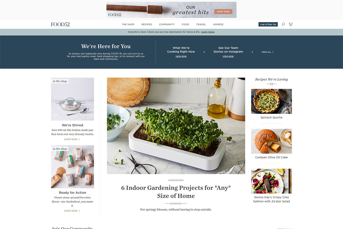
Have a great homepage
The homepage of your food website is basically the first impression that a user or potential customer will have of your business.
You want to make sure that the home page captures the best aspects of your food, so that it encourages the visitor to check out more of the website.
It’s simple human nature, once we like what we see, we’ll want more of it! Apply these simple psychological concepts to the design of your website.


+ There are no comments
Add yours